It has taken me ages to write this post, partly because the days have been dark and dingy and so no good for indoor photography but mostly because my bedroom was a complete pig sty and I was too ashamed to take photos in there before I'd tidied up a bit. Now however I have shifted the pile of washing that was beside the bed, gathered up the errant lego bricks and hoovered up the biscuit crumbs that Toby leaves everywhere in his wake and for a short while I have a neat and tidy room.
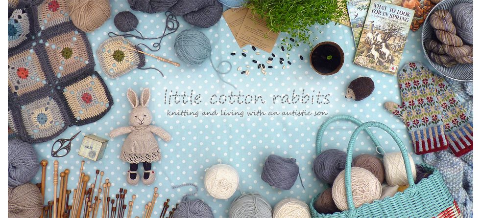
The 2nd misty blanket has turned out well and I'm enjoying snuggling under it at night. I ended up making 11 x 11 squares so a total of 121 which is a good fit for a king-size bed. I've used more structure in the placement of the colours than I did with the first misty blanket that I made – alternate rows of pink and orange centres interspersed with aqua, green and teal. Each square has 4 rounds of mixed neutral grey, cream and beige tones and is topped off with one round of charcoal grey. Then the whole thing was ringed with 5 rounds of charcoal and finally 3 alternate single crochet rows of silver, cream and silver. It's big, pleasing to my eye and definitely cosy.
Having the blanket on the bed however has made me realise how much I want to change the paint colour in our room. H finished painting in there a few weeks before Amy was born so we've had this deep blue for nearly 16 years now and I'm tired of it. I'm feeling that a lovely soft, dove grey colour would be calm and perfect, anyone have any paint suggestions?
Happy weekend all, it looks like being a warm one here so I may have to go and take my blanket off again!

This is such a beautiful piece of work. I admire your choice of colours and the pattern. It’s pure beauty.
I discovered you on Ravelry and have just bookmarked your blog. Thank you for sharing with us.
LikeLike
It’s absolutely gorgeous, so beautifully made, and such lovely colours. One of my favourite ever blankets. Wishing you and yours a good weekend. CJ xx
LikeLike
Stunning blanket J. I think feature walls are still popular. Maybe a warm charcoal on the headboard wall and a chalk white elsewhere, we find that it’s then easy to change the look of the room by changing just the feature wall if we fancy a change. J x
LikeLike
How wonderful your beautiful blanket would look against a Persephone grey wall.
LikeLike
It certainly does look cosy Julie, I adore those soft muted shades….beautiful!
I think a pale grey would be prefect for your wall!
Happy weekend,
V x
LikeLike
I love the idea of a soft dove grey room, but would it be too wacky to suggest doing a strip of maybe 2″-3″ squares at around picture rail height made up of sampler pot paint colours that would match the colours at the centre of the crocheted squares?
That blanket is very beautiful and I can see why you are enjoying cuddling up underneath it so much.
LikeLike
I’ve no clue, but I agree, a soft color would be soothing. Your blanket is so lovely.
LikeLike
I think this is probably my favourite blanket of the last year! The palette is perfect and so restful after all the colours I’ve been swamped in. Well done – another work of beauty!
LikeLike
The blanket is so lovely, well done. I always love your colour choices and the diamond pattern that is created by the corners is mesmerising! It’s a lovely generous size too:) I think you’re on the right lines with a Dove grey for the wall – I love soft tones on walls – I have painted nearly all of my house in Craig & Rose Stucco! it started with one room and just spread out from there! It gives off such a bright, light and soft warmth. Very soothing when needed, but energising too! It’s not often I find a paint colour I love -I’ve painted the bathroom twice already and it’s getting a new colour soon – a soft green to replace the plum that I thought it could take! not so! It just weighs me down! Choose a colour that is uplifting, makes you feel lighter, one that makes you smile when you wake up:)
Kate x
LikeLike
Amazing Blanket. I love the color combination.
LikeLike
Such a beautiful blanket!
LikeLike
I have a paint suggestion for you Julie – Farrow and Ball’s “Plummett” would be perfect! We have just painted our sitting room in it, and it is both warm and calm. Quite a blue grey. Would look lovely with your blanket colours. Goes really well with orange and acqua accents (which we also have)
LikeLike
PS I forgot to say, the blanket is absolutely beautiful!
LikeLike
I just had this shock seing the last 2 pictures, just because the painted wall. I didn’t remember seing it before, so when I was looking to your first pictures, I imagined a cosy room, with grey or kaki walls (something dark, even if beige should fit), with old furnitures and linen or cotton, darko wooden floor and old painting on the wall…
Your blanket is really lovely and sweet, I like very much those colors. Even if it doesn’t quite fit with the modernity of the room. It makes me feel of : comfy, quiet, sweet lights, book, tea…
Old blue or old pink on the wall would also suit with this blanket, I think.
LikeLike
There’s a paint colour called blackened white which is a lovely soft grey, I think it’s farrow and ball…
LikeLike
Your blanket is beautiful, calming and cosy. Lovely work!
You are right that it is time for a new paint colour but I wonder if grey will set your blanket off sufficiently. I think you might need a bit more contrast, so that your gorgeous blanket doesn’t doesn’t disappear. Let us know what you decide!
LikeLike
Amazing blankt! I love those nice neutral colors. It looks so sophisticated! 🙂
Greetings from Austria!
Emm.A
LikeLike
I think soft grey walls would look perfect with your beautiful blanket.
LikeLike
Beautuful blanket! A nice shade of Farrow & Ball grey or grey-duck egg would look lovely and calming. B&Q also do a nice ‘period living’ colours range ….I think they’ve changed the name now, but in the past they have had some beautiful shades and the paint is thick and luxurious. Although I like your blue wall, the only thing with blue is it’s such a ‘cold’ colour…having had a blue kitchen when we first married, I took to painting it and it was crazy how much warmer it felt once it was a warmer colour! Maybe even some thick neutral wallpaper would do it. Your blanket is beautiful and needs ‘setting off’ 🙂 xx
LikeLike
Hi Julie, your blanket is absolutely beautiful, so perfect! I am just finishing my first ever crochet blanket which is a lovely easy pattern from ‘just pootling’ Kate! I have painted my bedroom in Laura Ashley’s pale dove grey and it is exactly what it says on the tin – beautiful soft colour and looks lovely in all lights, their dove grey is nice too but slightly darker. Love to you, Susan xx
LikeLike
Wow Julie — it’s just beautiful. What a LOT of work — Love Love Love it!!!
LikeLike
Oh, it’s so beautiful. I love the way it looks on the white duvet. I think a grey wall behind the bed will be so peaceful and soothing. You did a fabulous job.
LikeLike
Such a lovely blanket! I agree, another calmer colour would really go nicely with the blanket 🙂
LikeLike
What a beautiful blanket and what a lot of work! Well done Julie!
LikeLike
What a fabulous blanket, why don’t you pick one of the colours – like the coral pink – out of it and have 3 walls off white/grey and one darker feature wall behind the bed?
LikeLike
Love the color sensibilities of your blanket – well done!
Pale paint will require a coat of primer before trying to cover with the new color. Without the primer you might need 3-4 coats of the paler paint, and still have that deep blue show through.
LikeLike
As cores são simplesmente maravilhosas.
LikeLike
Love it as much as the first
LikeLike
Beautiful blanket, love the colours and pattern. I think you are right a nice peaceful colour scheme to relax in expecially if it has been a difficult one. xcx
LikeLike
Oh, the blanket is beautiful! Have a look at Ecos Organic paints. They do all their different types of paints in 180 shades. I’m not connected to them at all but we’ve used their paints a lot. We’ve just painted our bathroom floor in their “Flume” colour which is a pale grey.
LikeLike
It looks amazing! I am impressed with how quickly you got it done. The colors and color placement turned out beautifully. I would definitely paint a more neutral color. You will have a wonderful peaceful room. You deserve it after this long winter. Take a bow you amazing woman!.
Cathy
LikeLike
Oooh! That turned out rather well Julie! And actually, I think it looks good against the blue wall.xx
LikeLike
Oh such a beautiful blanket, I adore it.
We’ve just painted our sitting room Pavilion Grey by Farrow & Ball, which I love. It’s soft and muted and cosy and clean all at the same time. A definite vote for that!
LikeLike
Truly, truly beautiful Julie, a blanket that will be much loved I’m sure. I have to agree with you – a dove grey wall would look stunning…
Kate xx
LikeLike
I love your blue walls and the new cosy; and thought as I was reading this post that the new cosy softened the walls some. The cosy is a very good complement as a soft muted colorway to that bright blue.
LikeLike
I’m always interested in the colors that people use for things. I like the blending of quiet blues and neutral beiges with that lovely spark of bright color in the centers. Cheery but restful.
If you are going to paint, I agree with your dove gray option. All I’ll say is to buy a good quality rather than a cheap paint. They cover better and look better in the long run. To cover that blue, you might also need primer.
LikeLike
oh this is absolutely stunning, I love the colours
LikeLike
Your work on this blanket is stunning Julie, congratulations! I love your colour choices, they are outstanding. Dove Grey would look wonderful with this blanket but did you know as we grow older we see more yellow? I love the warmth of the sun and the happiness it brings, evening lighting makes soft lemon look like a beautiful sunset too! Have you thought of a similar colour for your room. I have one question I would dearly love you to answer please. What method did you use to put your blocks together sooooo neatly? Stunning, just stunning…
LikeLike
Hi Julie. Your blanket is beaut. I love the subtle colours and the generous size is ideal. Farrow & Ball Elephant’s Breath is a lovely warm grey paint shade that looks good with white paintwork and accessories, I think it is no 229. Enjoy planning your colour scheme. Worth a look if you are considering a grey scheme. All the best, Sandra
LikeLike
What an absolutely beautiful piece of work – you have every reason to be bursting with pride!
LikeLike
Wow, absolutely stunning! I really need to learn how to crochet. I’m determined now that I’ve seen your blanket. Did it take a long time to make? I think a soft dove grey would be beautiful in your room and compliment your blanket perfectly. Thank you for sharing as always. Have a lovely weekend. X
LikeLike
Hello!!
It´s so beautiful your blanket, I want to made one for me…. soon!
thank You for sharing with me your life, childrens, photos, proyects, everythings!
LikeLike
Your blanket is beautiful ! I enjoy reading your blog and seeing all of your pictures. Have a nice weekend.
LikeLike
Fantastic you have finished your blanket which looks great. I love reading your blog. I live in NZ and our walls have been various colours but one that works well with ANYTHING is Resene Black White, makes white look white and creams cream, not dirty. We have it on all our walls. Ceilings and trims are White. Floors are either wooden parquet or grey soft pure wool carpet. It makes art gorgeous and even better messiness tidy!! No matter how high the pile of washing becomes. Have fun choosing. Best regards Nicky
LikeLike
What a gorgeous blanket! I love the soft, natural tones. I think dove grey would be beautiful for your walls 🙂 x
LikeLike
Oh my word, that has to be the most beautiful crochet blanket I have ever seen, it’s stunning Julie, jaw droppingly so!
LikeLike
Oh my goodness Julie ….. that is one very gorgeous blanket, I can’t beleive you’ve now made two, you have such staying power! Such a warm and cozy colour pallette too.
Wishing you a wonderful weekend.
love Jooles x x x
LikeLike
Such a gorgeous blanket… if you feel the need for a color change, and you think Toby will go through it rather happily, it means it’s the right time ! Go for it girl! sometimes, just those little changes make a big difference on our lives… Feeling better and fresher… It’s almost springtime 😉
LikeLike
Julie
I love your blanket. It is so peaceful. I think a dove grey would be lovely. Carla
LikeLike
It is totally and utterly gorgeous!!!!! Really fantastic!!! One of the colours for your blanket would be lovely on the walls – although I do love the blue, but understand too the desire for change! xx
LikeLike
I love Rockport Grey by Benjamin Moore but there are probably some other gorgeous greys out there. Prime the walls first with a color blocking primer otherwise you will be painting forever !
Love, love the blanket…you are brilliant, Julie…
LikeLike
Wow! Your blanket is gorgeous…those colours are so serene. I think you’re right about the wall colour and a dove grey would be perfect. I’m also a huge fan of that teal blue tho so maybe 3 walls in the grey and the one behind your bed in teal blue???? xxx
LikeLike
Hi Julie.
Farrow and Ball ‘Dovetail’ is a gorgeousness warm grey. It has warmth and a purpley hint tp which makes it look lovely with other greys , blue and green and allows oranges and yellow to ‘pop’ against It.
Gorgeous blanket.!
LikeLike
Absolutely beautiful, the colours are exquisite.
LikeLike
The blankett is so beautiful. Where i can find the pattern? I will bei so happy, äs i can make this blanket too! Magny greetings from Germany!!!
LikeLike
Gorgeous blanket !!! I have the similar paint in my bedroom. We have made it last year.
Ciao,
Miriam from Italy
LikeLike
Elephant breathe farrow and ball- warm grey!! Beau with ur rug x
LikeLike
A softer grey blue me thinks. Only because that is the color of my bedroom. 😀
Your blanket turned out just lovely!
LikeLike
Your blanket is gorgeous Julie! Makes me want to go straight out and buy more wool which is what always happens when I look at your work!! Xxx
LikeLike
oh Julie, it is so truly beautiful xxxxxxxxxx
LikeLike
What a stunning blanket! Fantastic achievement. Thank you for sharing, Sarah x
LikeLike
Misty blanket number 2 has come up brilliantly and looks great on the bed. Dove grey or maybe blueberry white for the walls to tone them down in order to show off the colours in the misty blanket.
LikeLike
Exquisite – no other word for it.
LikeLike
I used the Dulux Timeless range in Thimble Case for my bedroom. It’s a soft pale grey but with a little warmth. Have fun with the tester pots!!
LikeLike
Your blanket is stunning! I would recommend Farrow & Ball’s ‘Ammonite’ – I think it’s their palest grey and fairly new. I’ve recently done a room in it with contrasting white skirting and window borders – looks gorgeous and would work well with your new blanket 🙂
LikeLike
This is such a lovely blanket. I love the pattern that it makes from the spaces in the granny squares. Really nice colors, too!
LikeLike
This is beautiful and those tiny middles of colour are like little jewels in the blanket. Your tones are subtle and sophisticated, all in all a triumph of hard work and talent!
LikeLike
that blanket is beautiful, and so pleasing to look at! you should be very proud of it 🙂 i think a soft, pale grey would work wonderfully in the room – nice and calm, but not too dark for when the weather is grey and the days short, and easy to brighten up a bit with some accessories 🙂 jenny xx
LikeLike
Your blanket is beautiful. I amazes me how much knitting and crochet you can get done. You must sit up late working on your lovely creations. Grey is modern at the moment so something soft would go well. I know having a family is a full time job and especially with a teenager and an Autistic child, painting walls seems rather low on the list.
LikeLike
Have just recently discovered you! I love this blanket and would love to make one. Will have to add it to my must do list, but finish some other projects first !!! Thank you xxx
LikeLike
I, too, have always loved and I have been inspired for my projects by the colors you have chosen in your knitting, Julie! You were brave, to have chosen that cobalt blue for your emphasis wall! I, too, have done the same thing in my second home: I chose cobalt blue for my formica countertops!!! Oh, did I worry about that when the installer was just about finished. When he left, I sat down and just cried… This was a new home and I hadn’t stained the cabinets yet (fruitwood, later) nor were there marshmallow white walls, nor were there french bistro cobalt blue and white checked draperies up. I loved it when it was all done.
Now, I agree that the cobalt blue is too strong.I, however, have a different suggestion: how about a soft turquoise? I think I see you have used a similar color in the center of your granny squares?I’m thinking the grey in the quilt will pop since there will be no competition of grey from the walls.I live in the northwest of U.S. where we have many rainy, grey days and the turquoise might be more uplifting, and it would also be a warmer, more light color to warm up those days that aren’t like summer!Paint companies are different here – otherwise I might suggest an exact color. I’m sure you will find a fabulous color!
Mary in Oregon
LikeLike
Such a beautiful blanket, the colours are so lovely. Choosing a paint colour is so hard, we have just painted our grown-up daughter’s room. She is coming home to Australia live for a few months after living in Scotland for 2 years. I know that grey is the modern colour now, but I wonder if a soft warmer colour might work better for when you have gloomy winter days?
LikeLike
That is gorgeous. Period. I admire your ability to finish it. Amazing. I hope to finish a tube of lip balm before losing it. One day.
LikeLike
Patrina Handley Fantastic effort, Julie.Meryl told me about your bedcover ,it’s a marvellous example of skill, patience and beauty.Congratulations.Your chickens are true beauties!! I hope they start laying soon.
LikeLike
Hermoso trabajo!!! Bella combinación de colores, muy delicada. Gracias por compartir tu lindo trabajo y tu vida y experiencias . Gracias.
LikeLike
It’s beautiful! I think a soft grey on the walls would be lovely, but make sure the tone suits whether you prefer it to be warm or cool. I’m just catching up on all my blogs, so apologies for the late comment, you’ve probably made a decision already.
LikeLike
I LOVE MISTY!!! I have started my own after seeing your original (I’m new to crochet and it’s taking a while even though it will only be big enough to toss over the back of the sofa!!) Thankyou for the inspiration!
Debbie
LikeLike
This is the most beautiful piece – I so admire your work and writing, it’s very inspiring.
LikeLike
totally , totally gorgeous
LikeLike
What a beautiful blanket. I learned myself to crochet last year. I wonder if I will ever be able to crochet something as beautiful as this. Maybe with a lot more practice. (www.aviewtothefells.com). Joan
LikeLike
Hi,
What a stunning piece of work- wish I knew how to crochet- will learn one day!
Paint colour suggestion- ‘York White’ mixed for you by Dulux is (in my opinion) an excellent toning colour- it is nothing like white except that it goes with everything …dark , muted, bright…you name it and is one of those shades that manages not to drown out features- which your blanket really is( a fine feature) You can have a sample pot mixed in a decent enough quantity to really fully judge if you like it in all lights.Same goes for any other shade they have – and they have a vast range.
Hope this helps?
LikeLike
Wow, my eyes did a double take when I saw the photos with the wall in the background, that is gorgeous! I thought you did that on purpose, with the gorgeous soft faded denim and neutral colors in your blanket contrasted against the bright blue on the wall. I love it just the way it is, but I can imagine I would be up for a change after 16 years too! This is a very much belated congratulations on the birth of your little girl! I remember visiting your blog many, many years ago, maybe it was a few years after you first started. Wow, how time flies! Well, its been so nice to find you again.
LikeLike