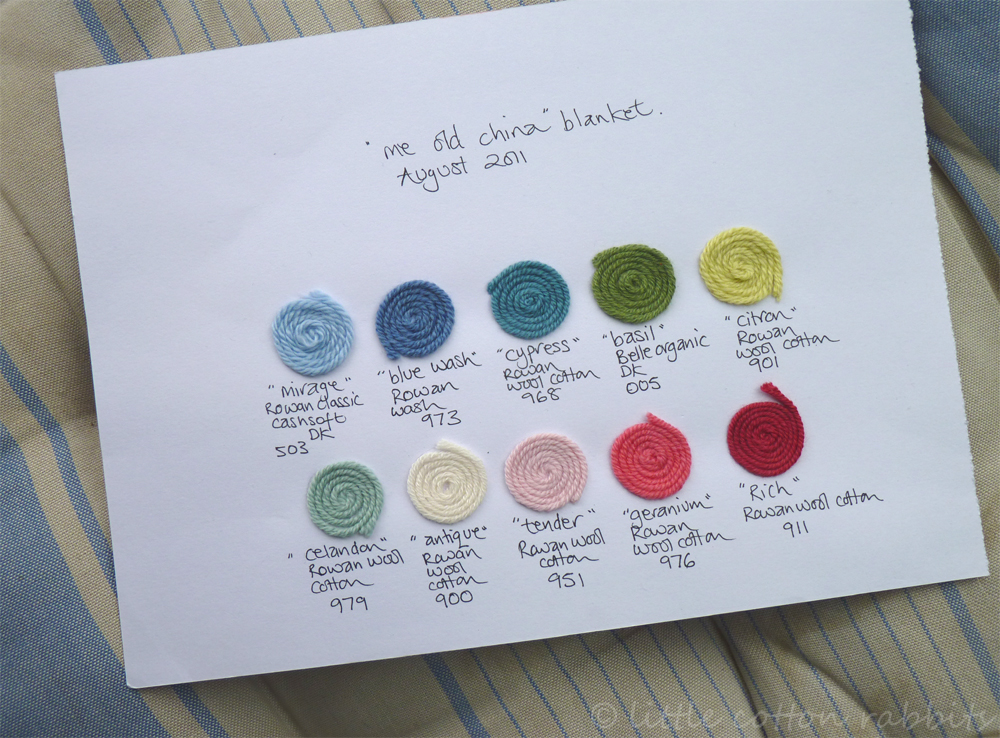
Thanks for all of the kind comments on my new blanket. A couple of people asked what yarns and colours I’m using, so here’s a sample…
Because I wanted very specific colours I’m mixing 3 different yarns – Rowan Wool Cotton (50% merino, 50% cotton), Rowan Belle Organic (50% organic merino, 50% organic cotton) and Rowan Classic Cashsoft DK (57% extra fine merino, 33% microfibre, 10% cashmere). Despite having slightly different finishes and thicknesses they all seem to be working well together so far.
I’m using the celandon as the main background colour and random selections of the other colours in the granny squares – I’ll post some more pictures when it’s a bit bigger!

Oh blimey, even your planning is pretty!
LikeLike
Oooooh, pretty!! 🙂
LikeLike
Yikes Julie – it’s like a litle sampler!
What it is to be so organised! All I’ve got is bits of yarn threaded through the labels they came with so I don’t forget what’s what!
LikeLike
Beautiful colours and I like the idea of mixed textures 🙂
LikeLike
The celandon is my favourite, as your background colour it’s all going to be beautiful. I love Rowan wool/cotton as well such a lovely yarn to work with.
I think that’s one of the pleasures of crochet being able to mix different yarns and it all seems to work!
Vivienne
LikeLike
Agree with you DottyCookie – beautiful! Thanks for sharing your colours and yarns with us Julie x
LikeLike
Sorry to be commenting late, but with all of the animal heads you have taken pics of,…NO elephants???!!!…SOB!!
LikeLike
I love your little color card! I need to do that for the multi-color things that I knit. Great idea.
LikeLike
Oh good grief! I even love the swatch board. You are lovely to do that for us. xx
LikeLike
The colors you chose are absolutely gorgeous. Loved seeing them paired with your china in the previous post.
LikeLike
Oh I love this swatch – almost as much as the blanket!!!
LikeLike
I wish I was as organised as you 🙂 It’s looks like it will be a beautiful blanket, you have impeccable taste and an excellent eye for design.
LikeLike
dottycookie beat me to it, but let me just add that your yarn palette is so pretty it should be framed. of course, we’re all yarn-o-holics here, so that makes sense, right? :o)
LikeLike
Your colour card is so beautifully presented Julie! All your photos are just delightful and I desperately want to rush to the wool shop and buy exactly the same colours as you but I am going to try to restrain myself and see if I can build up my own collection of colours inspired by you – wish me luck as I don’t have your colour skill! ;o) Lucy xx
LikeLike
Look at you and your very designy, organized color card. So unlike what I do – which is grabbing whatever in whatever order, and never being quite sure what I’ve done. The card itself is really lovely. The difference between us – you have grace and taste and I’m slap dash and rustic and covered with dog and horse hair. How I enjoy what you do!
LikeLike
Love that your plan/colour board is so pretty even on its own!
xx
LikeLike
Love your colour choices. The earlier blanket is divine. Sorry not been about – off sick with chronic shoulder,lower arm and thumb pain. Either arthritis or too much crochet!!! Waiting for x ray results. Speak later.
Zoe x
LikeLike
Beautiful colors
LikeLike
I even love the color card! I wish I could sit down with you and watch you knit and crochet for an hour or two…maybe I could progress a little further than knit, knit, knit!
LikeLike
Okay – taking a second look at the color. The swatches don’t seem to match up with the skeins in the tray – (isn’t that always the way?). The Rich looks darker on the card. And now, I can see the blue/green shades more clearly – looking at them on the card. the basil, the rich and the germanium are much more saturated shades than the others – and you do want to be able to step up and down in value –
I think, for me, that maybe the cypress, basil and citron are the tones that are causing the conflict, though. The cypress is so intense in it’s leaning to blue, but still green – or maybe I like it, and it just fights with the blue wash for me. Something in that range isn’t blending well for me now that I’m looking at the question – and i see what you mean about the citron – that yellow does give it kind of neon thing.
The colors are all beautiful by themselves. And in combination with most of the others do very well – for me. There’s just something – it’s like there are two or three really nicely blending things going on in groups, but the groups don’t seem at peace with each other.
maybe just connecting with the white would make all that go away, though = I bet it would. This is a very hard question for this early in my thinking day.
LikeLike